Kitchen
22 Scandinavian Kitchen Ideas That Make Cooking Feel Different

Jump to section
- The counter rule that changes everything
- What morning light does (and how to let it in)
- Warm wood — the material that changes everything
- Open shelving (done right)
- The coffee corner principle
- Herbs in the window (and why they work)
- Linen in the kitchen
- The backsplash you’re not looking at properly
- Evening lighting in the kitchen
- The things worth decanting
- The seasonal kitchen
The kitchen is the room people most often renovate when they want a new feeling in their home.
It’s also the room where most of the transformation can happen without touching a single cabinet.
Scandinavian kitchens have a quality that goes beyond the visual — something about being in them feels different. Slower. More considered. The kind of kitchen where making a cup of coffee in the morning becomes an actual moment rather than a fumble through clutter.
That quality isn’t the result of a renovation. It’s the result of a series of decisions about what stays on the counter, what light the room gets, and which materials you surround yourself with. Here’s how those decisions work.
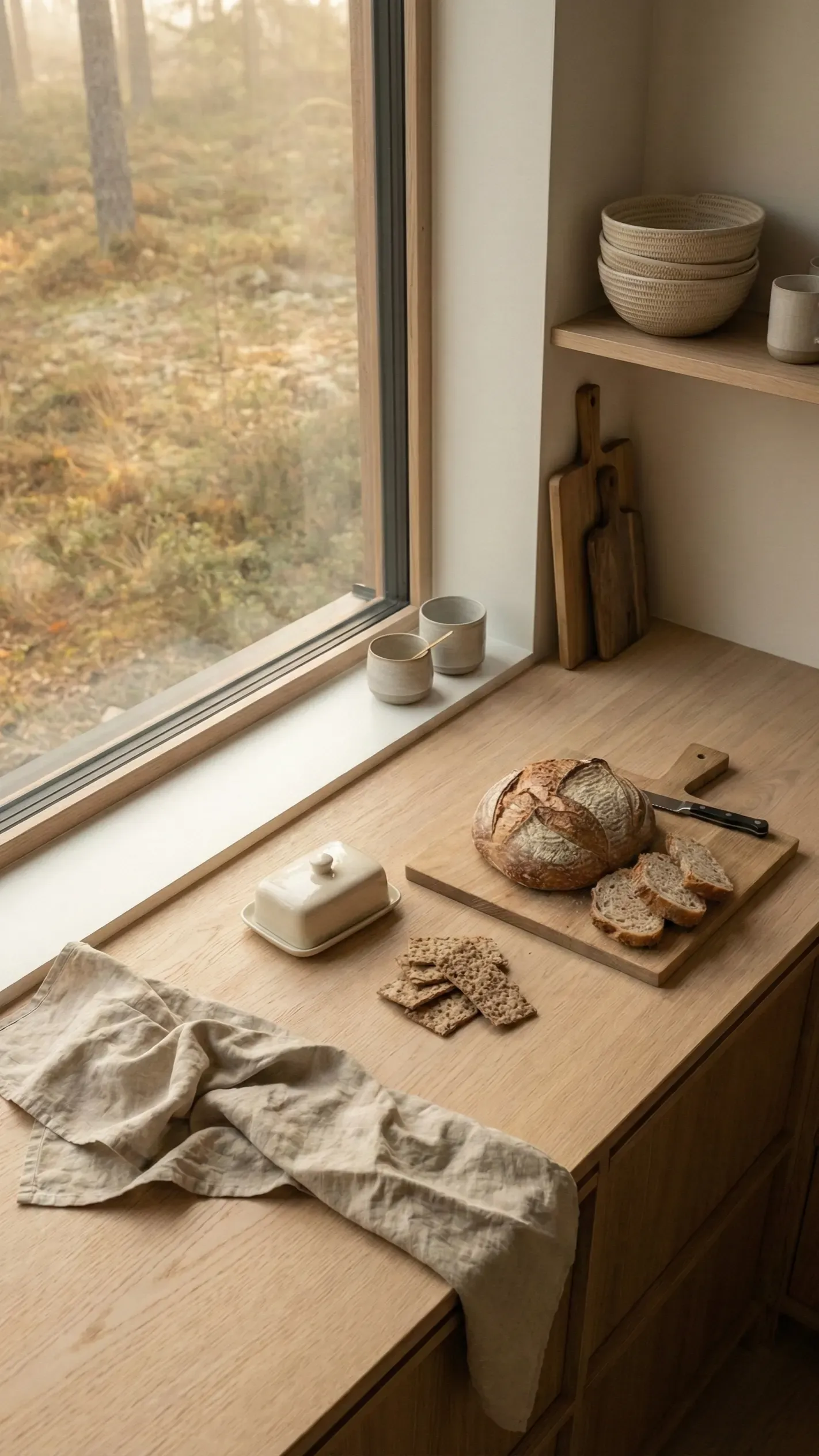
The counter rule that changes everything
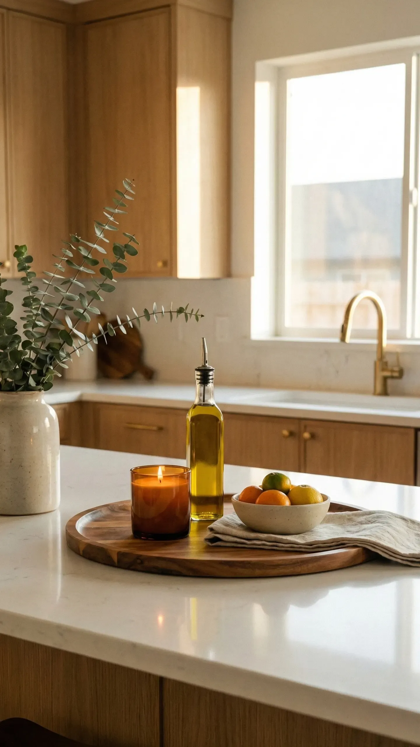
The single biggest visual difference between a Scandinavian kitchen and most other kitchens is counter space.
Not counter size — counter emptiness.
In a Scandinavian kitchen, the counter is mostly clear. Not because the person who lives there doesn’t cook, or doesn’t have things — but because everything that doesn’t actively belong on the counter has been given a home somewhere else. Behind a cabinet door, in a drawer, on a shelf designed for it.
What remains on the counter is the result of a decision, not a default. A ceramic crock with wooden spoons. A bowl of fruit. A cutting board leaning against the backsplash. A small tray corralling the coffee things.
Each of these items is both functional and worth looking at. Nothing is there because it ran out of space somewhere else.
The 80% rule is a useful target: aim to keep roughly 80% of your counter surface clear. Style the remaining 20% deliberately.
Start here: Pick everything up off the counter and put it somewhere else — even temporarily. Then ask of each item before you put it back: is this beautiful, or is it just convenient? If the answer is only convenient, it needs a cabinet.
What morning light does (and how to let it in)
The Scandinavian kitchen is designed around natural light in a way that most kitchens aren’t.
The window above the sink is kept completely clear — no plants, no jars of things, no curtain that blocks the view. Not because Scandinavian designers don’t like those things, but because they understand that the light coming through that window in the morning is more beautiful than any object placed in front of it.
Watch what happens to a kitchen when the morning sun hits an unobstructed window. The light spreads across the counter. It catches the grain in the wood. It makes shadows move as clouds pass. It’s doing more decorating than anything you could buy.
This is also why Scandinavian kitchens so often use light-filtering rather than blackout treatments — gauzy linen panels or nothing at all. The goal is to modulate the light, not eliminate it.
The move: Clear your kitchen window completely. Live with it for a week and notice the difference at 8am.
Warm wood — the material that changes everything
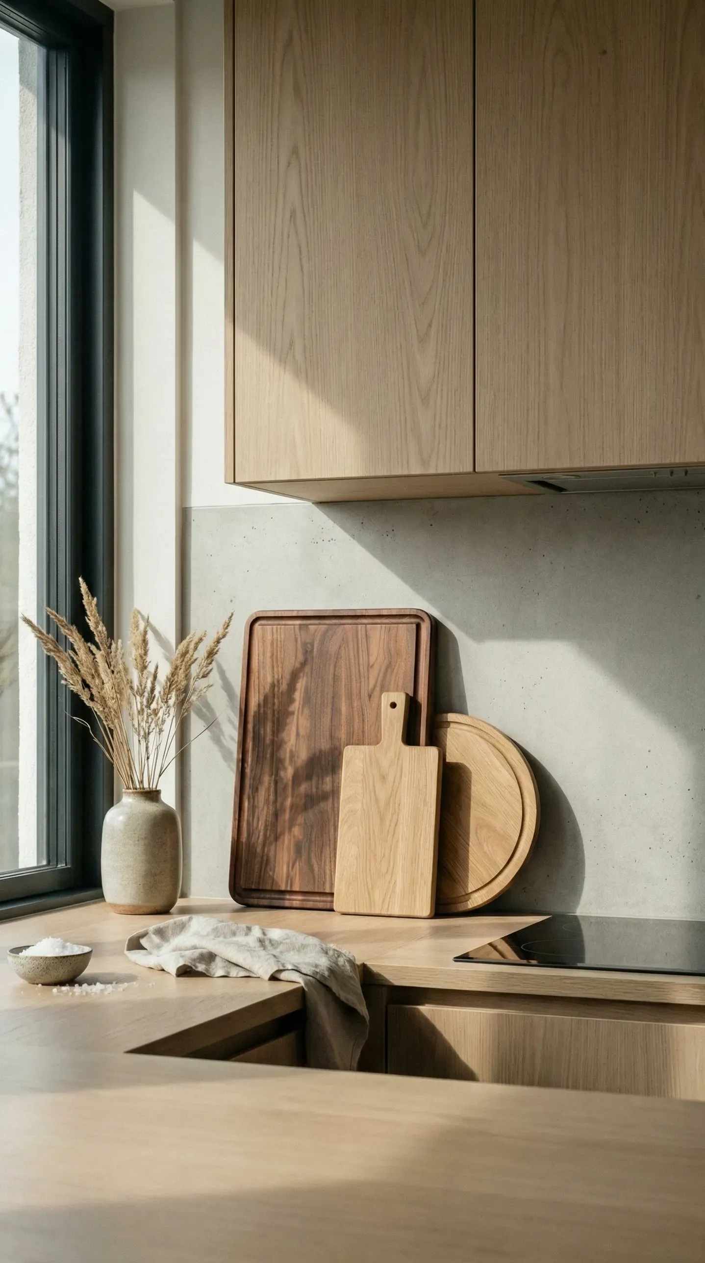
Ask someone to picture a Scandinavian kitchen and they’ll probably picture light wood.
That instinct is right, and it’s not aesthetic — it’s functional. Wood is warm where tile and painted MDF are cold. It has grain and variation where other materials are flat. It ages in a way that feels intentional rather than worn out.
Light oak is the most classic choice: pale enough to stay calm, warm enough to avoid clinical. Ash works similarly. Both add texture to the kitchen without adding visual noise, which is exactly the balance this style needs.
You don’t need to replace your cabinets to get this. The most impactful wood addition to most kitchens is one of these: open shelving in oak to replace a wall of upper cabinets, a wooden side table or island, wooden cutting boards displayed on the counter, or even wooden handles on existing cabinets.
Each of these adds the warmth of the material without the budget of a renovation.
The move: Add two or three wooden cutting boards in varying sizes and lean them against the backsplash. It costs almost nothing and does more for the kitchen’s warmth than most larger purchases.
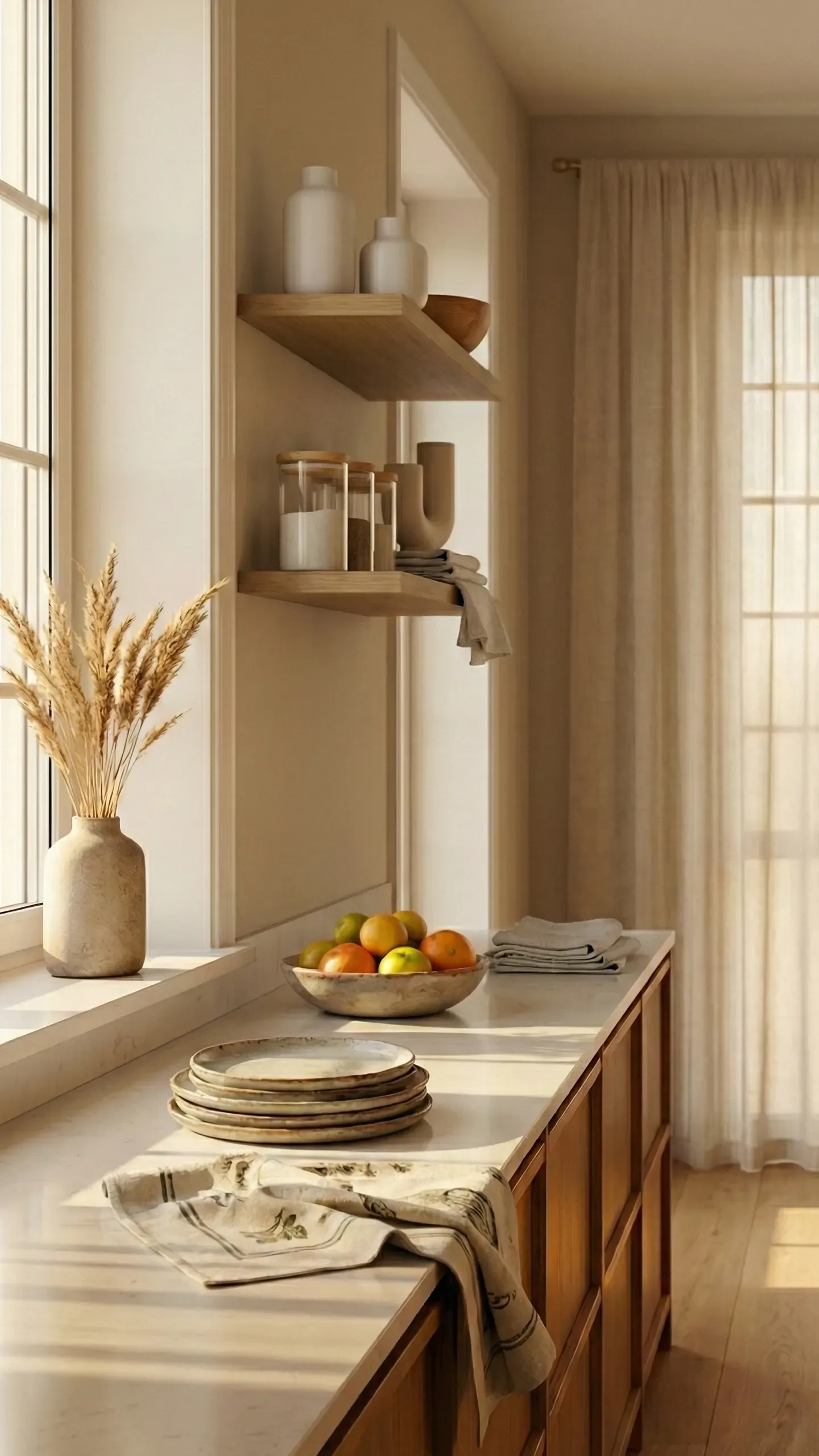
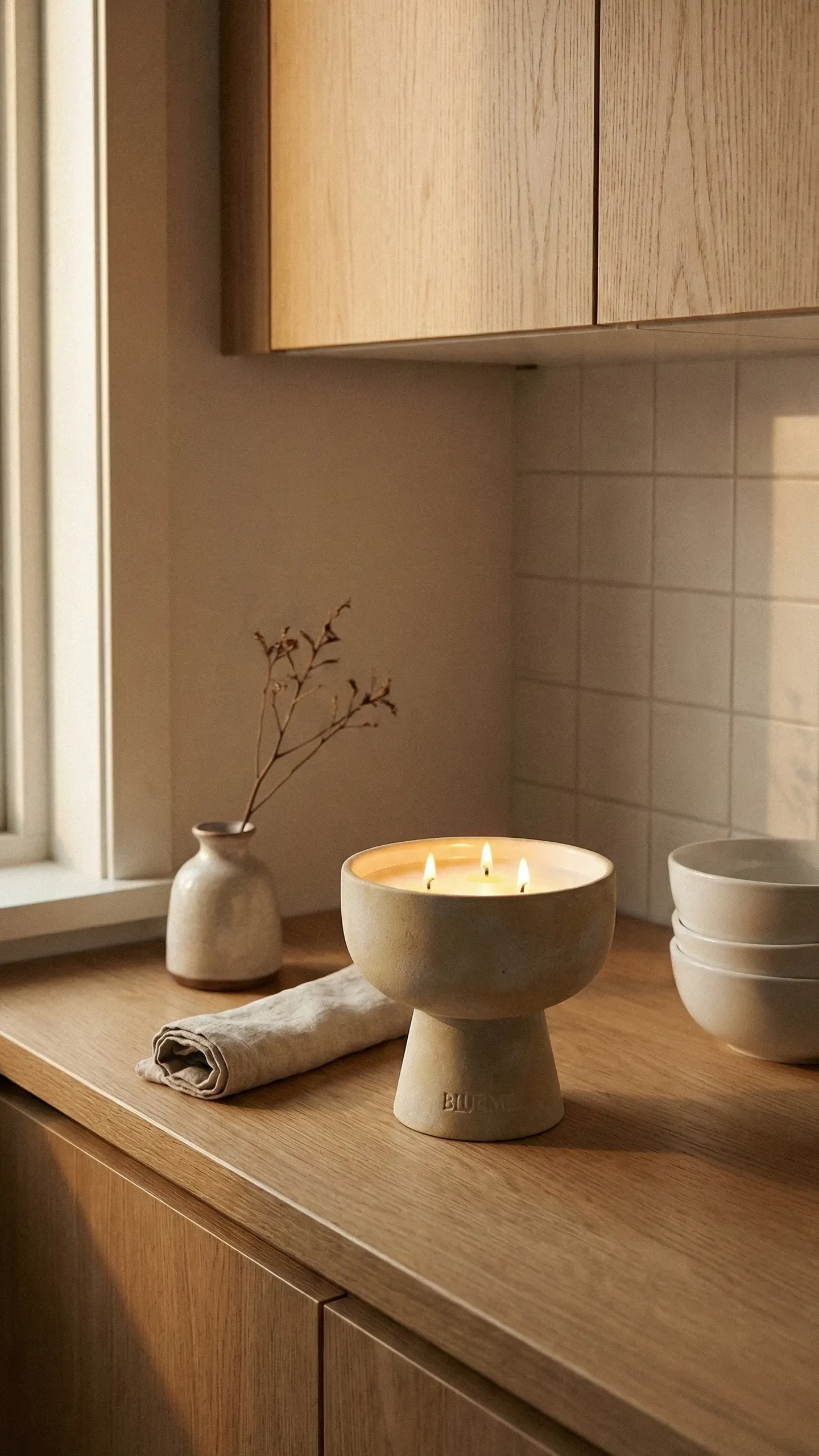
Open shelving (done right)
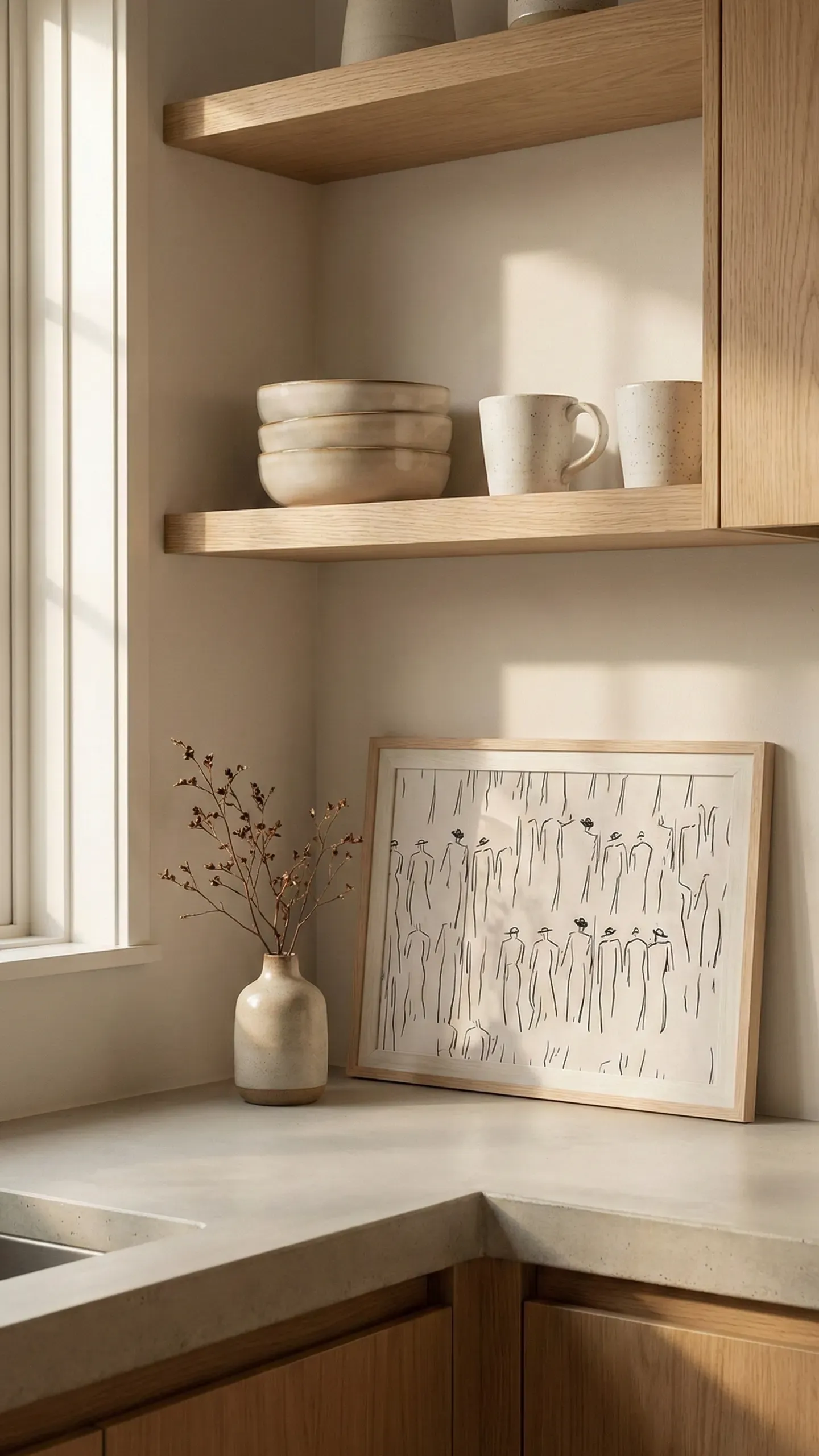
Open shelving is one of the most contested topics in kitchen design, and the reason is simple: done wrong, it looks like you ran out of cabinet space. Done right, it’s one of the most beautiful things in a kitchen.
The difference is entirely in what goes on the shelves and how much of it there is.
Scandinavian open shelving holds the things you use daily — the things worth looking at. Good ceramics. A few glasses. Some bowls. The olive oil in a bottle worth displaying. What it doesn’t hold: the vitamins, the half-empty packets, the things you bought for a recipe two years ago. Those live behind doors.
The styling principle is the same as the counter: generous breathing room. The shelf should never look full. Groups of objects with visible space between them, always.
And the ceramics themselves matter. Handmade or handmade-looking, in warm neutrals — cream, beige, soft brown, the occasional pale blue that reads as almost neutral. Plastic containers and bright packaging don’t belong here.
The move: If you have open shelving, remove everything and replace only what you’d be happy for a guest to see. If you’re considering adding open shelving, start with one run above one section of counter and see how you feel about the maintenance.
The free Scandinavian Styling Checklist — room by room, change by change.
The coffee corner principle
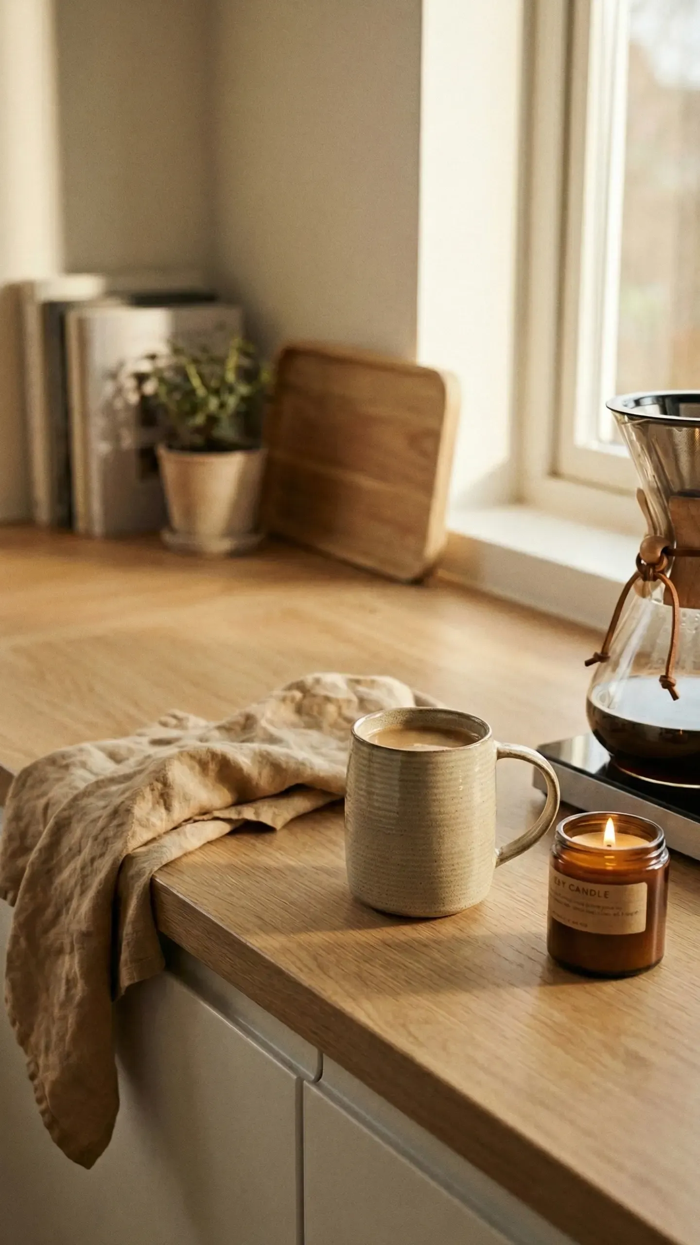
Here’s an organising principle that works for more than just coffee: designate zones.
A Scandinavian kitchen resists the chaos of everything being everywhere. Instead, specific activities have specific, defined homes. The coffee corner — machine, two or three cups you actually love, a small tray to contain it all, possibly a little jar of sugar or a small plate for biscuits — stays in one place and looks good doing it.
The tray is key. It’s what separates “styled” from “cluttered” in a kitchen vignette. A tray gives the objects a boundary, tells the eye where to stop, and makes the whole thing easy to move when you need the counter space.
The same principle works for a baking zone, a bar cart, a tea station. One activity, one defined area, contained on a tray or within a clearly delineated section.
The move: Find the thing you use the counter for most often that currently looks like clutter. Give it a tray and a home. See if it stops bothering you.
Herbs in the window (and why they work)
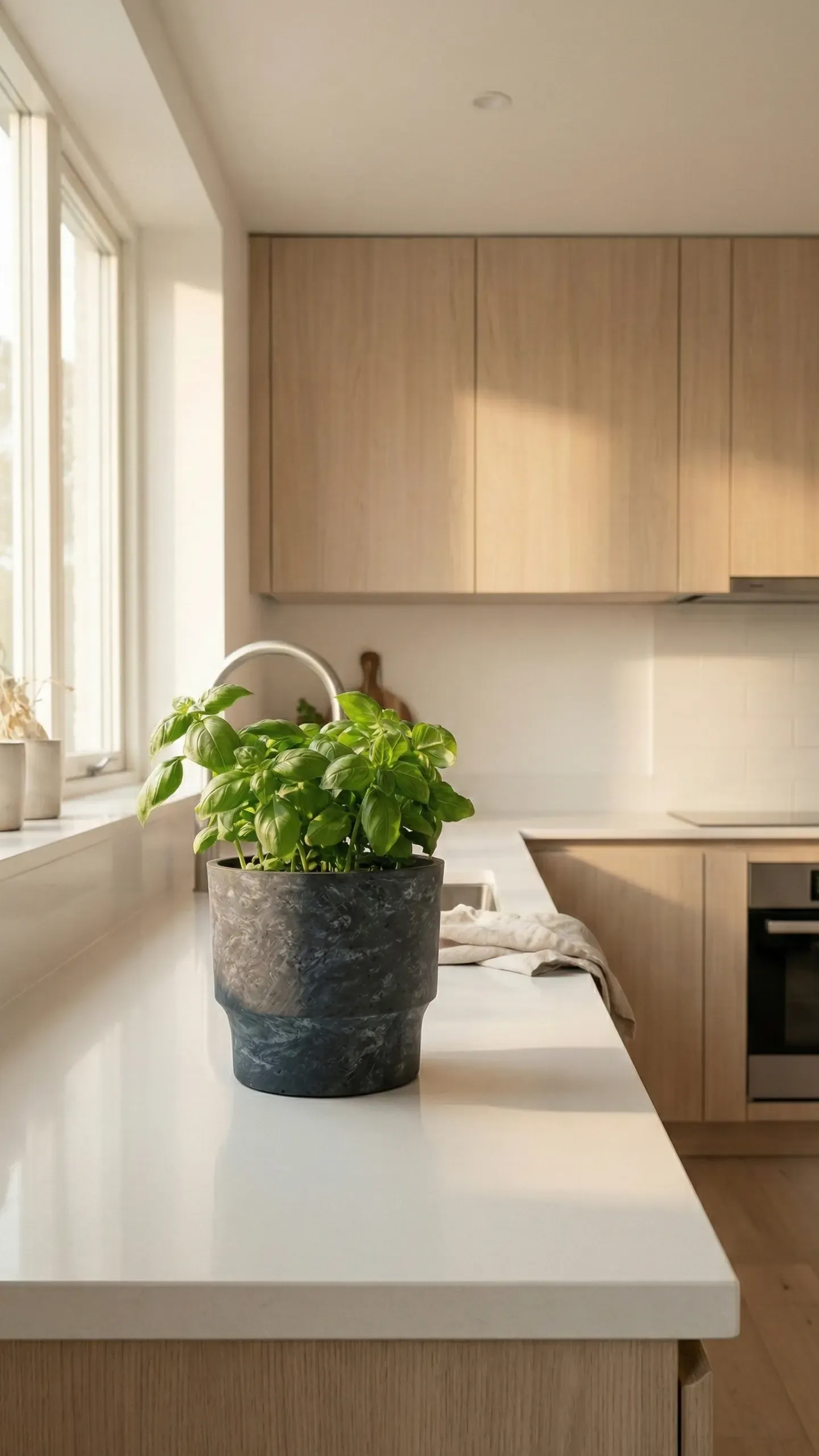
This one might sound too simple to include, but the herbs-on-the-windowsill is one of the most effective small changes you can make to a kitchen.
It works for three reasons. First, it adds the one thing neutral kitchens often lack: green. Not a lot of it — just enough to make the eye relax. Second, it does something more than look decorative: you actually use them, which connects the kitchen’s appearance to its function in a satisfying way. Third, moving them from their supermarket plastic pots to matching ceramic or terracotta pots transforms them from groceries into decor.
That repotting is the entire move. The same herbs, the same windowsill, completely different feeling.
The move: Buy two or three fresh herb plants this week. Repot each one into a ceramic or terracotta pot in your kitchen’s palette. Line them up on the sill.
Linen in the kitchen
Every surface in a Scandinavian kitchen is hard — tile, wood, stone, metal. The one soft element that breaks that up is the linen tea towel, and its job is more important than it looks.
A washed-linen towel hanging from the oven rail softens the kitchen’s hard edges, adds texture to the palette, and signals that someone who cares about how things feel lives here. It’s the kind of detail you notice without knowing you’ve noticed it.
The only rule: stick to the room’s palette. Oat, warm white, a simple stripe in sand or grey. Bright patterns and novelty prints break the calm immediately.
The move: Buy a set of three identical linen towels in a neutral tone. Replace whatever is currently on your oven rail.
The backsplash you’re not looking at properly
Most people choose a backsplash based on how it looks in isolation. The better question is how it looks in relation to everything else — and specifically, whether it adds calm or competes with it.
Scandinavian kitchens tend toward backsplashes that recede: warm-white tiles, large-format stone, zellige in sand or cream. The texture is interesting up close but restful from a distance. High-contrast grout, busy patterns and very bright whites all do the opposite — they draw the eye constantly and make the kitchen harder to settle in.
The grout colour is more important than almost anyone realises. Matching grout (close to the tile colour) makes a backsplash read as one calm surface. High-contrast grout makes every tile a separate visual event.
The move: If you’re planning a backsplash, choose a grout colour within two shades of the tile. If you already have high-contrast grout and want to address it, grout paint is a cheap weekend solution.
Evening lighting in the kitchen
The kitchen suffers from the same overhead-light problem as the living room, and the solution is similar.
Most kitchens have one ceiling light that covers everything in the same flat brightness. It’s functional, it’s fine for cleaning, and it completely kills any atmosphere after dark.
Under-shelf or under-cabinet lighting in warm white transforms the kitchen at night. Suddenly there are surfaces that glow and surfaces that don’t — depth and warmth instead of a bright box. A statement pendant over the island or dining area does the same above.
Both are much cheaper and less disruptive than any other kitchen change, and the impact at 6pm when you’re cooking dinner is difficult to overstate.
The move: Add warm LED strips under one shelf or cabinet section. Put them on a separate switch or smart plug so they come on automatically in the evening.
The things worth decanting
Decanting — moving things from their packaging into matching containers — sounds like a project for people with too much time. In practice it takes one afternoon and makes a notable difference to the kitchen.
The reason it works: packaging is designed to be noticed in a store, not to be calm in your kitchen. Bright colours, bold fonts, competing logos. When you move the same contents into plain glass jars or simple ceramic containers, the visual noise drops immediately.
You don’t need to decant everything. Start with the five things on your counter or shelves that you look at most often. Oats, pasta, rice, coffee, tea — these are the usual candidates. Glass jars let the contents themselves be the decor, which is often genuinely beautiful.
The move: Buy five matching glass jars. Decant the five most-visible dry goods in your kitchen. Recycle the packaging.
The seasonal kitchen
The final idea, and perhaps the most Scandinavian of all: the kitchen changes with the seasons, gently.
Not a renovation, not a new colour scheme — just a few small swaps that acknowledge where you are in the year. Spring branches in a ceramic vase where the dried botanicals were. Summer citrus in the fruit bowl instead of apples. Candles moved onto the counter when the dark months arrive.
These changes cost almost nothing and do something that no amount of permanent styling can: they make the room feel alive and present rather than set and forgotten.
The move: Look at your kitchen and identify the three things that could change seasonally — the vase contents, something on the counter, the colour of a towel. Write them down. Change them this week to something that feels like now.
The free Scandinavian Styling Checklist — room by room, change by change.
If the kitchen felt like a lot to think about, the free Scandinavian Styling Checklist breaks it down into a simple room-by-room checklist — free changes first, then small improvements, then the things worth investing in. It’s the same approach, in ten minutes per room.


